Screenshots showcasing beauty in unexpected places
Screenshots showcasing beauty in unexpected places
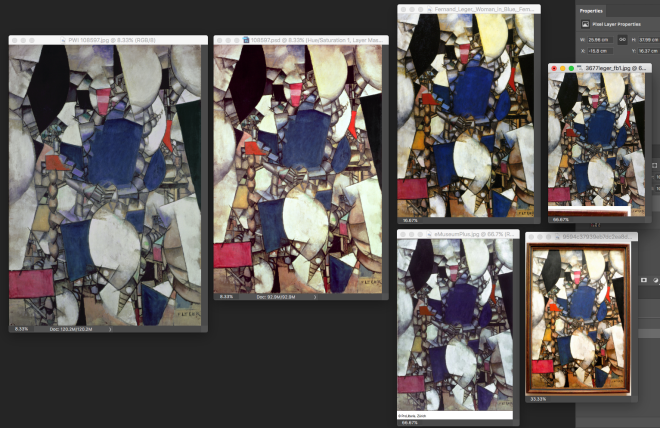
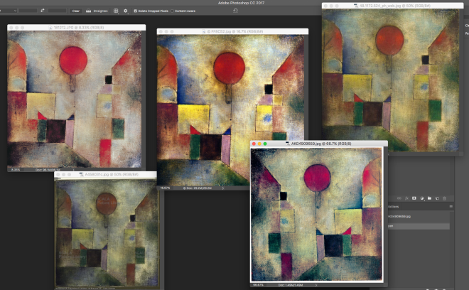
The joys of colour proofing an Art book – which is the right one?!? It will be well worth the time and effort of researching, colour correcting in photoshop and re-proofing to get it right. The joys of print.
p.s. the next book in the series, “Modern Art In Detail: 75 Masterpieces” by Susie Hodge, which I’ve almost just finished working on this week, will be out in the UK & US later this year…
Happy publication day to the beauty that is Art in Detail: 100 Masterpieces, by Susie Hodge, out now in the UK from Thames & Hudson!
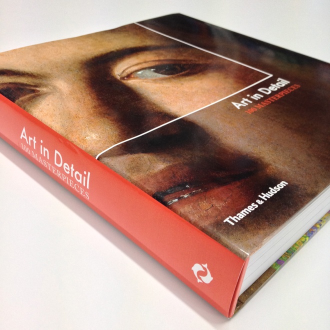
Cover and interior design by me, all 432 pages, it’s a good looking book if I may say so myself. Jam packed full of lovely impressive and large artworks and close up details featuring paintings from pre 1500 medieval art The Annunciation by Fra Angelico, all the way up to modern day The King’s Death by Paula Rego, and of course everything in between – enjoy!
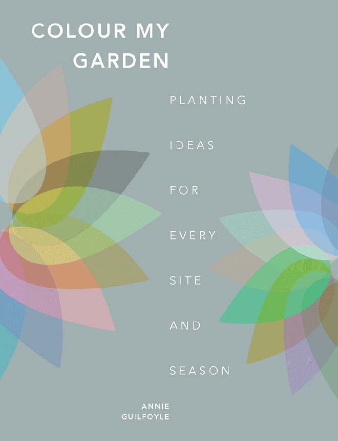
Some cover design ideas for a book titled Colour My Garden: Planting Ideas for Every Site and Season. Created using a graphic/illustrative approach, rather than photographic.
A newsletter template I designed for The Quarto Group’s Foreign Rights team, to showcase new and upcoming titles from across the company, in a simple but striking and flexible format.

It had to be in keeping with The Quarto Group‘s branding, purple is the company colour, and Gotham Rounded is their chosen font, orange is Foreign Right’s division colour. I created a design that was in modular form so the layout could be tailored to fit a wide variety of content quickly and easily each time. Components could be added, removed and combined together in a range of compositions as desired, depending on the quantity and orientation of the visual material to be included.
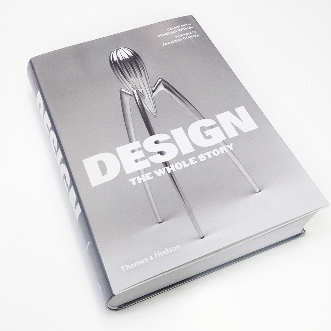
Out now in the UK – Design: The Whole Story, general editor Elizabeth Wilhide with a foreword by Jonathan Glancey. Designed by yours truly, all 576 pages, thoroughly enjoyable to work on and a beauty of a book in the end. A fascinating read, jam packed full of wonderful, inspiring and desirable designs – learn and enjoy!
Another illustration (1 of 4) I was commissioned to create for La Montana, a range of gorgeous scented candles inspired by a British couple’s new life in a delightful Spanish mountain village. This one was called “Winter Oranges” – the scent is a warm, spicy, zesty blend of Valencia orange, cinnamon, red apple, and clove.

This illustration was quite fiddly to do, in particular my attempt to make the ingredients as simple in form but still recognisable through the use of limited shapes and colour. I maybe didn’t pare it down enough, I have a habit of wanting to keep adding more and more detail to drawings but actually often, and especially in this case, less is more. Some of the vintage travel posters these illustrations were inspired by were created so simply with a very limited colour palette and line work and they look amazing – it’s quite a skill, one I’m working on and keen to explore. I’m certainly interested to find out what it smells like as I’m sure it will be warming and delicious – a perfect Christmas scent (not that far away now…)
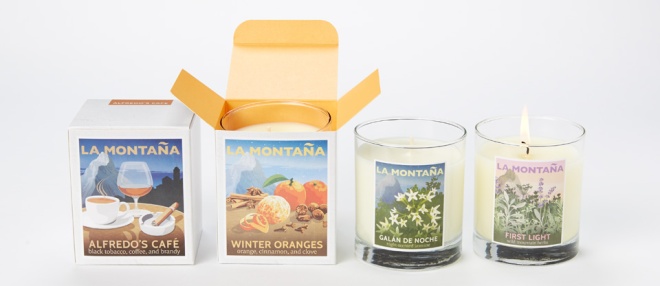
You can see the previous Alfredo’s Cafe Poster here, and all the other illustrations I created for the La Montana range here.

An imagined book cover I created for the unfinished The Silmarillin by Tolkien.
The commission was for inclusion in the title The Greatest Books You’ll Never Read by Bernard Richards.

The watercolour painting is my own creation and great to be able to use it for this cover, I felt it was a perfect fit, I just had to find a way to add the necessary text and combine the two in an appropriate and interesting way.
The book is out now in the UK and US, and actually contains a total of 7 book cover designs by me! You can see them all here.
Here are some jacket design options I put together a while back for the title War: The Whole Story – a new book idea presented at back Frankfurt Book Fair in 2013.
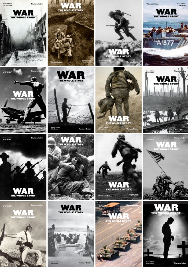
It was harder than I imagined it would be, to find the right image. You don’t want to glorify war and you also don’t want to hide from the reality that it entails. It needs to be powerful and impactful but not too morbid and brutal on the senses and put people off. It has to capture the mood and spirit of war, all wars if possible, past and present. How do you capture the feeling of war in one encompassing image that doesn’t focus particularly on one war?? Do we feature a more relevant modern day image or an historical and nostalgic viewpoint of the topic. Should it have been something human and approachable to really draw us in and play on our emotions or something neutral and symbolic and all encompassing… it’s tricky!
You can see the final one that was chosen in the end here, and take a look at the sample spreads I designed here as well.
Which of these one do you like, prefer most, or think works the best and why?
I’d be curious to know your thoughts!
